Figma Check Designs: the Falsifiable Suggestion pattern
Figma shipped Check Designs on June 4, 2026 — a four-tab modal that audits design files against a published design system. The teardown focuses on the modal's core interaction decision: surfacing every machine recommendation as an explicit, overridable row that shows its reasoning, rather than a one-click black box. The extracted pattern is Falsifiable Suggestion.

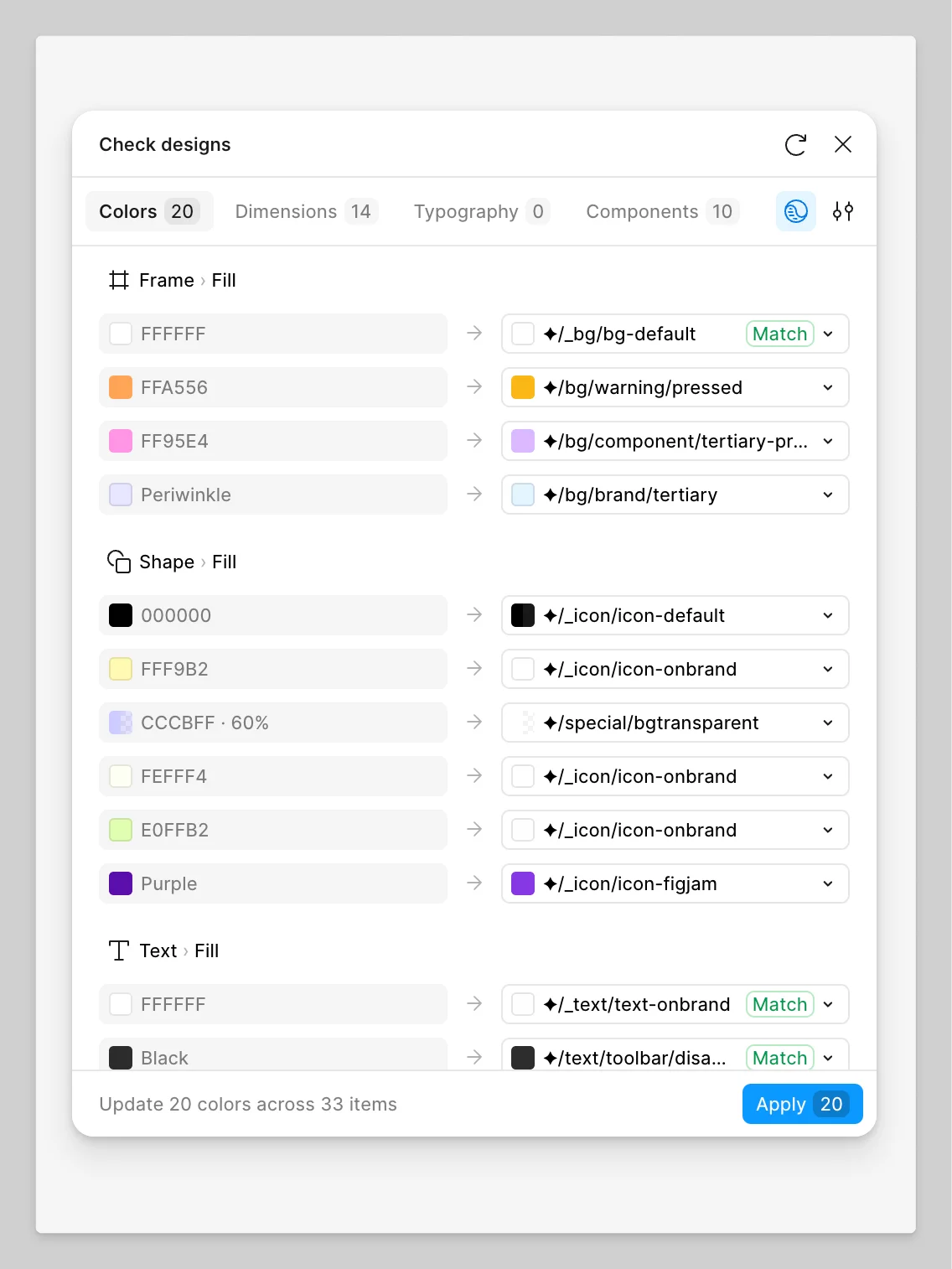
Figma shipped Check Designs to general availability on June 4, 2026. 1 The product description is tidy: a four-tab modal (Colors / Dimensions / Typography / Components) that scans your design file against a published design system, flags what's off, and suggests the correct fix. 2 The release notes call it "one click" away from a fix.
That framing is accurate but undersells the real decision. The more precise way to describe what shipped is this: Figma built a quality-enforcement tool that refuses to hide its reasoning. Every suggestion is a row. Every row shows you the current value, the proposed replacement, and a dropdown to pick a different one. The tool never applies anything without your explicit action. In a product that has shipped Figma Agent (LLM-driven design generation) and Figma Make (prompt-to-app), the choice to make this particular tool fully transparent and overridable is the design decision worth examining.
Modal anatomy: four tabs, one status bar, one action button
The modal's chrome is minimal — title, a reload button, and a close button across the top. Below that, the four tabs — Colors, Dimensions, Typography, Components — each with a count badge showing how many violations were found in the current selection. Two icon buttons sit to the right of the tab row: a library/scope selector (the globe-with-brackets icon) and a settings panel (the sliders icon). The main body of the modal is a flat list of suggestion rows grouped by layer type (Frame, Shape, Text). Each row is a single line: no nesting, no expandable sub-rows, no modal-within-a-modal.
The modal opens to the first tab that has violations. 2 If your file has zero color violations but 14 spacing violations, you land on Dimensions, not Colors. The count across all tabs is visible before you do anything. This is the only place in the modal that gives you a full picture before you start acting.
The bottom of the modal is a fixed status bar: "Update 20 colors across 33 items" — and a blue Apply button with the count of pending changes embedded in it ("Apply 20"). Everything between the tabs and this bar is the working surface.
Loading content card…
The tab structure and what each tab can (and cannot) do
The four tabs are not symmetric. 2
| Tab | What it scans | Can auto-apply? |
|---|---|---|
| Colors | Hard-coded hex values, color opacity; also WCAG 2.0 AA/AAA contrast violations | Yes — binds to variables |
| Dimensions | Hard-coded spacing, padding, corner radius values | Yes — binds to tokens |
| Typography | Hard-coded font styles and sizes | Yes — binds to text styles |
| Components | Detached components, components from wrong or unlinked libraries | No — flags only |
Three tabs offer automatic replacement: select a suggestion row and click Apply, and the hard-coded value is swapped for a design system token in one action. The fourth tab, Components, only flags. It can tell you that a component has been detached from its source library, or that it belongs to a library not currently in scope. It cannot replace the component for you.
This asymmetry is honest. Swapping a color token is a deterministic transformation — there is one source of truth and the tool can make it. Replacing a detached component requires design judgment about which component in the target library is the right substitution; the tool cannot make that call without an LLM. Rather than add an AI step that would change the tool's fidelity model, Figma drew a clean line. The Components tab is detection-only.
The Colors tab also has one notable constraint: it cannot swap color styles, only bind hard-coded colors to color variables. 2 If your design system is built on Figma's older styles architecture rather than the newer variables system, Check Designs gives you suggestions but cannot apply them. The help documentation states this plainly: "Swapping color styles isn't currently supported. You can only bind a hard-coded color to a variable." The constraint is not buried — it's in the first section of the limitations block.
The suggestion row anatomy: current value → arrow → proposed replacement
Each row inside a tab follows the same format: a color swatch or value label on the left (the current state in the file), a right-pointing arrow in the middle, and a suggested design system token on the right (the proposed new state), followed by a dropdown chevron.
The visual encoding does real work. The left side is what exists in the file right now — often a raw hex value like
#FFA556 or CCCBFF · 60%. The right side is the system name — ✦/bg/warning/pressed, ✦/special/bgtransparent. The diamond glyph (✦) signals that this is a variable from the design system library, not a freestanding value. Rows where the proposed replacement is an exact match get a green "Match" badge. Rows without "Match" are closest-similarity suggestions.The dropdown on the right is not decorative. Clicking it shows the full list of candidate variables from the scoped libraries, ranked by similarity to the current value, then by naming hierarchy, then by usage frequency across the organization. 2 The suggested value at the top is not the only option; it is the algorithm's first guess. This distinction matters — the tool is offering a ranked recommendation, not issuing a verdict.
Hovering over a suggestion row moves the canvas to center the affected layer and highlights it in the Layers panel simultaneously. 2 Hovering over the suggested value — the right column — previews the change on the canvas without applying it. Two hover targets, two different information functions: the row hover gives you spatial context ("where in my file is this?"), the value hover gives you temporal context ("what would this look like if I accepted it?").
Why deterministic, not AI
Figma was explicit about the engine. 2 "Check designs does not use LLMs or generative AI." Suggestions are ranked by three factors: similarity to the current value, variable naming and hierarchy, and usage frequency across the team or organization. These are computable properties. Given the same input, the tool produces the same output.
Paige Costello (Figma's VP of Product) described this at Schema 2025 in October 2025 as a "custom model" that "will suggest the right variable to use in that context, and let you check the work before applying it." 3 That phrasing — "let you check the work" — was not accidental. The explicit check step is load-bearing.
Loading content card…
The design reasoning behind determinism becomes clear when you consider the use case. A designer running Check Designs on a file before handing it off to engineering needs to know whether each suggestion is correct before applying it. If the tool uses an LLM, each suggestion carries non-zero hallucination risk — the designer now has to audit suggestions for plausibility rather than just decide whether to accept them. A deterministic tool shifts the burden: the suggestions may be wrong due to bad variable naming or incomplete library scope, but they are wrong in a transparent way. The designer can look at the row, see the logic, and make a call.
The community has already found the edges of this model. One forum user reported that a hard-coded spacing value was suggested for replacement with a border radius token rather than a spacing token, despite having an explicit
spacing token in the library. 4 The user's conclusion: "the feature is really nice by the way and already saves a ton of time!" The system got a suggestion wrong; the user could see that it was wrong and skip it. That is the correct failure mode for a tool built on transparency.Loading content card…
A separate forum request asks for the ability to ignore or exclude specific suggestions — for cases where a designer has deliberately used an off-system color for a developer annotation or a throwaway exploration. 5 The absence of this feature is the current hard edge: the tool has no concept of intentional deviation. Everything off-system surfaces as a violation. The user notes that without an ignore mechanism, the tool becomes unusable when the file contains any intentional exceptions. This is the expected next increment: adding a "mark as intentional" affordance that preserves the systematic audit without false-flagging design decisions.
The named pattern: Falsifiable Suggestion
Falsifiable Suggestion is the interaction model in which a tool surfaces machine-generated recommendations as explicit, auditable, overridable rows — where each suggestion exposes its reasoning, accepts rejection or substitution without friction, and applies only on explicit user confirmation.
The specific mechanics: each suggestion shows both the current state and the proposed state in the same visual field. The proposed state is editable (via dropdown or alternative selection). A hover on the proposed value previews the outcome before commitment. Nothing is applied until the user clicks Apply. Undo behaves identically to any on-canvas edit — the tool does not own a special undo stack. 2
This pattern applies under three conditions.
The tool operates in an environment where the user cannot tolerate opaque errors. Check Designs runs just before design handoff — the point where a wrong suggestion applied automatically could propagate into a production build. In that context, a false positive applied silently is worse than a false positive surfaced visibly. The interaction model is calibrated for this: the cost of an undetected mistake exceeds the convenience of automation.
The underlying recommendation logic is rule-based and therefore auditable. Because Check Designs uses a deterministic algorithm, every suggestion can in principle be traced to a specific comparison: this hex value, against these variables, ranked by this frequency data. A user who sees an odd suggestion can reason about why it appeared. If the tool used an LLM, the row could not carry the same information density — "the model thought this was closest" is not auditable in the same way.
The user population has enough context to evaluate suggestions. A designer who can read
✦/bg/warning/pressed and recognize it as wrong for a text fill has the domain knowledge to catch errors. A tool aimed at a population without that knowledge would need to either hide the suggestion mechanism or invest heavily in explanation UI. The choice to expose token names directly signals who this tool is for.PM takeaway: When you build a recommendation or suggestion feature, the default interaction model is: the system decides, the user confirms or ignores. Falsifiable Suggestion is a stronger variant: the system proposes, the system shows its work, and the user can substitute before confirming. The relevant question is not "how confident is our model?" — it is "can our user evaluate the suggestion if it is wrong?" If yes, expose the reasoning. If no, you need either a higher-confidence model or a different interaction entirely. Check Designs answers this by making every suggestion a falsifiable claim: here is what I found, here is what I recommend, here is my reasoning (in the form of the value names), and here is where you override me.
Cover image: Figma Help Center, Check Designs modal — Colors tab, June 2026 2
Add more perspectives or context around this Post.